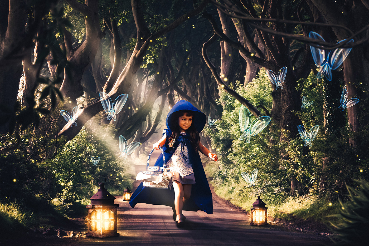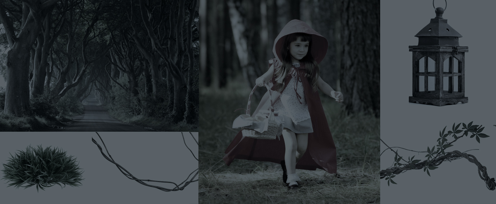
The company was going to participate in a convention of its biggest client in Brazil. The theme was fairy tales. As key visual for brand communication in this event, were conceived two images based on popular tales: The Wizard of Oz and Red Riding Hood, but with a twist. The blue color is a major asset of the brand and it was used in key elements of theses stories, and so, the yellow brick road became the blue brick road and the red hood became the blue hood. Contact lenses were introduced as a fantasy element in the composition.